Design SystemsUI/UX Design6 min read1650 words

Mastering Dark Mode Design Systems: Typography, Contrast, and Micro-Interactions

How to craft deep contrast ratios, harmonious brand highlights, and effortless visual hierarchy in modern dark-theme digital products.

Elena Varga
Elena Varga
LEAD WEB ARCHITECT
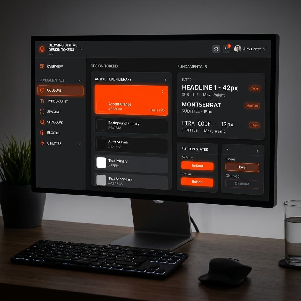
Glowing digital dark mode design tokens interface

Key Takeaways

  • Dark surfaces evoke focus and sophistication — but only when contrast ratios are carefully calibrated.
  • Use off-white tones (#FAFAFA) on dark backgrounds instead of pure #FFFFFF to reduce eye strain.
  • Elevation in dark mode is achieved through surface opacity scales, not heavy drop shadows.
  • Limit accent color usage (e.g., #FF3E00) to focal points: CTAs, active states, and key metrics.
  • WCAG AAA requires 7:1 contrast for body text — test every text/background combination.
Executive Summary
ASTRELL Takeaways
ELEVATION LAYERS3 Layers

Surface Depth Hierarchy

Using subtle opacity scales (#000000 -> #09090b -> #18181b) instead of heavy dropped shadows.

ACCENT ACCURACY#FF3E00

Controlled Glow Dynamics

Strategic use of vibrant accents like #FF3E00 to draw focus without causing visual fatigue.

1. The Psychology of Dark Digital Surfaces

Why dark mode is the definitive choice for modern premium tech brands.

Dark mode is no longer just a luxury toggle; it has become the default presentation layer for high-end technology platforms, financial dashboards, and luxury design agencies.

When designed correctly, dark surfaces evoke feelings of focus, modern sophistication, and structural elegance. However, creating a dark design system requires far more than simply flipping background colors to black.

On dark backgrounds, light becomes your strongest architectural tool. Use it sparingly and with absolute precision.

Simon A., Technical Lead, ASTRELL

2. Contrast Ratios & Typographic Clarity

Balancing readability and visual impact.

Pure white text (#FFFFFF) on pure black backgrounds (#000000) creates high eye strain due to extreme contrast. Instead, professional design systems utilize off-white tones (such as #FAFAFA or neutral-100) paired with carefully tuned font weights.

We recommend combining clean sans-serif typography like Inter for body text with expressive display fonts like Space Grotesk for prominent headlines.
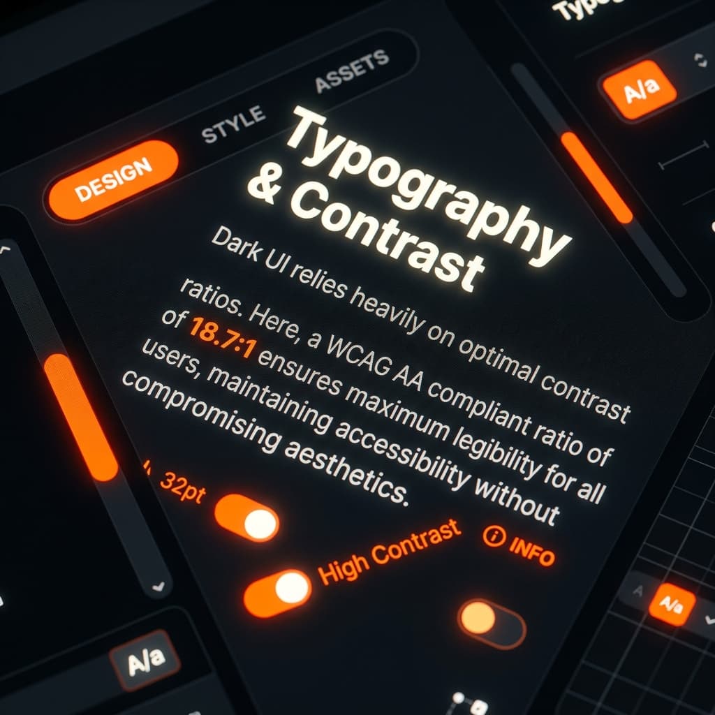
Premium typography contrast on dark surfaces

WCAG AAA Accessibility Standard

Ensure all primary body copy maintains at least a 7:1 contrast ratio against the underlying dark container surface for optimal readability across all device displays.

Frequently Asked Questions

For optimal readability, body text should maintain at least a 7:1 contrast ratio against the background (WCAG AAA). On a neutral-950 background, this means using neutral-100 or neutral-200 text rather than pure white.
Not typically. Pure black creates harsh contrast that causes eye strain during extended reading. Most premium dark modes use slightly elevated surfaces like #09090b or #0a0a0a, reserving true black only for the deepest layer or OLED-specific optimizations.
Instead of drop shadows (which are invisible on dark surfaces), use progressive surface lightening. Each elevation layer adds subtle white opacity: base (#09090b) → card (#18181b) → modal (#27272a). This creates clear visual hierarchy without shadows.
Learn More

Discover how ASTRELL can transform your brand.

Explore Our Services
Elena Varga
WRITTEN BY

Elena Varga

Architecting scalable web solutions, multi-platform UI frameworks, and conversion-engineered digital products.

CONTINUE READING

Related Articles

View All Posts
Ready to Build?

Let's Create Something Extraordinary Together.

Whether you need a complete brand identity, a high-performance website, or a strategic digital presence — ASTRELL delivers measurable results.

Book a Consultation